29 December 2024

Last Flight of the Year

Final Painting

Happy holidays, everyone!

I finished this painting, though I am not fully happy with the result. I took a little break from painting it last week (Christmas week). However, the year is ending, so I worked on it today.

What I learned while painting this piece:

  • Using circle brushes is good for laying down base colors; while using rectangular brush seems to be better suited for shading.
  • I can suggest lost edges by masking the lineart.
  • I still struggle to keep the final image when facing the canvas. (This is probably why I am not happy with the result. I image that I had in the beginning was different, but I did not know how to paint to get to that image.)
  • I prefer painting on a new layer while keeping the previous image I commit to as a base layer. I could feel reluctance to change when I had many layers.
Next time, I think I should focus on committing to a value composition before shading.

27 November 2024

Drawing Last Flight of the Year

"Last Flight of the Year" inked drawing

I worked on painting Tetris Attack back cover this month and the painting gave me problems. Problems that I did not yet solve. And so, while looking through old drawings pile, I found this pencil drawing and decided to work on it. Hopefully I would have some solutions for the Tetris Attack back cover when it is done.

Rough pencil drawing

I drew this in late 2022 as a part of a series of paintings leading up to the new year. It was overly ambitious and I only finished painting "Greeting Mrs Moon" in December 2023. I remembered drawing the cloud vortex on the right side after seeing wing tip vortex images. (Search for "wing tip vortex" images; it looks beautiful and serene.) Looking at it 2 years later, though, lessened the impact dramatically.

Instead, my new idea is to draw wind lines. In my mind, I could strive for 70/30 balance of textured/untextured area with the wind lines being the texture. Whether or not I will succeed is still unclear. We will find out next month!

30 October 2024

Back Cover for Tetris Attack Music Album

I am currently working on images for a Tetris Attack album project. With the front cover finished (read about my process for it here), next was the back cover.

Inked back cover

Image for the back cover should be something that can be covered by track list. With Tetris Attack in mind, I thought of the game world (B1) or in-game background tiles (B2).

First round of thumbnails

Xaleph, the project director, chose B1. He suggested adding musical bars for the front cover, so I added musical bar to the back cover as well.

Pencil sketch

This image came together rather quickly. It is simple with few elements. It gave me second thoughts. Is this too simple? Am I being lazy?

Inked back cover?

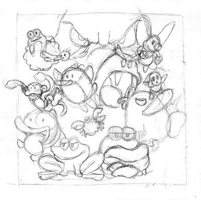
Just to see if there was something better, I embarked on another idea: a group shot of all the pal characters in the game.

Pals thumbnail

Before drawing this thumbnail, I needed to get familiar with all 8 pal characters. I did so by copying their in-game portraits. That was when I discovered even more characters: Froggy has crab friends, Poochie (the dog) has the monkey, Rapahel (the raven) and Gargantua Blarg (the head with fangs) has shy guys, Lakitu (the turtle on cloud) has the birds...

I sketched symmetric composition and asymmetric composition. I liked the symmetric one better, so I used it for the above thumbnail. For drama, I added a giant Bowser scowling in the background.

Pals pencil

When I showed this to Xaleph, his reaction was basically "Holy shit! Two cakes back covers!" And so I drew the pencil sketch. This time, the image was not simple. Each character is simple, but I got to be disciplined to get the placement, size, and posing good enough. Once I was happy with the pencil, inking was faster.

Next post, I hope I have something to show for the painting process. See you then!

26 September 2024

Painting Tetris Attack Music Album Cover

Final painting

I covered ideation process of this album cover in a previous post. In this post, I will cover my painting process.

The image will be the cover of an album that re-imagines music from the game Tetris Attack. The color scheme was intuitive to me: blue sky (the game intro says "Now, let's go play, together... Together under the clearest of blue skies."). Yoshi is green, while Lip is violet/pink in contrast. They are half in shadows for contrast...

Classic blue sky Trendy blue sky

I tried hard to come up with alternative color schemes. They cannot be radically different, so I simply varied the hue of the sky. In my mind, they are "classic" and "trendy".

  • Classic blue is how sky blue is usually captured. As an example, consider the cover for Tatsuro Yamashita's "For You".
  • Trendy blue is influenced by digital color aesthetics, where shifting hue to something unusual is considered interesting.

I presented the option to Xaleph, the project director, and he immediately chose classic blue. So began the painting process.

I started by adding gradient to the background sky to add interest. Next was the tedious process of painting local colors. I also worked on the shadows, making them more detailed. To simplify the process, I painted the shadows using a flat color. This way, I could focus on the shapes formed by the shadows.

Adding colors to lit area

Once the shadows on Yoshi and Lip were good enough, I started picking colors for the area in shadow. Mostly I picked the lit color, made it darker and more saturated, then shift the hue towards blue.

Meanwhile, I also added color to more background elements like the instruments, the game tiles, the rock Yoshi jumped from, and the flowers. The idea is to keep all elements at more or less the same stage to avoid overworking an area and neglect the rest of the painting.

Adding colors to shadow area

I thought the lit area should be brighter, so I applied an exposure adjustment layer. To my surprise, the whole painting was too dark; so I left the exposure layer as an overall brightening.

I started adding gradient and color variations on the lit area. I spent more effort painting ambient occlusion to the area in shadow. On hindsight, perhaps this was unwise; but it was necessary.

I had fun shading the game tiles. Combining simple shading with limited selection of colors created surprising pleasant illusion of "painted look".

Painting the game tiles and overall brightening

At this point of the painting, the logo was finalized. One small problem: I left too little space for the logo at the top. I did draw more elements outside the crop area so I enlarge the crop area and fit the logo into the image. I ended up with the composition below.

The final stretch was a bit of everything, usually summarized in this kind of article as "finishing touches". The most obvious ones were the drum and the yellow star tile. I increased the contrast as much as I felt was alright. I added highlights to Lip hair because I thought it was too plain...

Adding logo and finishing touches

After inking, I found the image was simpler than before inking. With colors, I thought the image was really simple with few elements. Still, I am happy with how this image turned out. Happily, the folks at the project Discord server seemed happy with it as well.

I did receive some feedback that Yoshi looks naked. I think I will add red saddle for the final version...

25 August 2024

Tetris Attack Music Album Logo

In the previous post, I described how I came up with the front cover of Tetris Attack rearrangement music album. The cover actually requires an additional element: album title logo.

Inked album title logo

The album title is "Tetris Attack: Hocus Pop! Opus". How would the title logo for an album that reimagined music from Tetris Attack look like? It is a tough question for me as I don't usually design logos. For hints, I browsed existing albums at OC Remix. I concluded that the logo should have the game title and the album title.

Tetris Attack felt "cute and friendly" to me, so I thought the text should be rounded. As a start, I simply combined the game title and album title. I had many questions in my mind. Should the game title be smaller than the album title? "Hocus Pop! Opus" is a long phrase for a logo. Can I break it into 3 lines? Should the game title be in the album logo at all?

Logo sketch round 1

The project director, Xaleph, picked #2. At this point, I experimented with what I knew about drawing a logo. I remembered feeling lost, unsure which idea I should draw on paper. My solution was to simply draw what I could think of.

  • #1 was a redraw of the logo idea picked in round 1 with one small difference: "Tetris Attack" was more dominant.
  • I experimented with arc look for "Hocus Pop Opus" in #2. I also attempted to simplify the busy look by using only 2 type faces in #2 (compared to 3 type faces in #1).
  • In the game, a match makes popping sound. This gave me the idea of drawing a "bursting" shape to contain "Hocus Pop Opus" in #3. I decided to emphasize "Pop!" and simplified "Tetris Attack".
  • I was attracted with the idea of fitting the logo in a circle. So I drew #4.

Logo sketch round 2

Xaleph liked #3 and #1. This informed the direction for round 3.

  • As I did in round 2, I started with a redraw of the "explode" shape idea with #1, giving more thought on the "explode" shape. For variation, I gave "Tetris Attack" a blocky type face and "POP!" a rounded one.
  • With #2, I experimented with soft "cloud" shape for cute & friendly feel. "Tetris Attack" was now more relaxed; on a ribbon. Mystical look for "Hocus".
  • #3 explored a fitted shape behind "Hocus Pop! Opus". "POP!" used a different typeface as the center of interest. "Hocus" and "Opus" looked pressed like tiles in the game. Finally, I simplified "Tetris Attack" with some aspects from the game title. The letters of "Tetris" followed the orientation in the game title; while "Attack" was a silhouette of the text in the game title.
  • For #4, I experimented with a new direction. "Hocus" and "Opus" were vines around "Pop", which in turn had Yoshi's egg. Note the stylized Yoshi head shape on the bottom left. I thought this one probably looked too busy; but it was a fun exploration.
Logo sketch round 3

Xaleph wisely gave his thoughts about different elements rather than simply picking one design. He wanted the emphasis on "Pop!" and the "burst" shape. The "Tetris Attack" element should be similar to actual in-game logo.

I was painting the front cover in parallel, and sat on this for a few weeks. When the colors were good enough and it was time to add the logo, I drew this one as a "final" version.

Final logo

The next post should cover painting the front cover. See you then!

29 July 2024

Tetris Attack Music Album Cover

I eluded in an earlier post about a Tetris Attack project. I have been working on a few drawings for the project. I got an okay from Xaleph, the project director, to post work in progress, so I'm posting my progress with the front album cover.

Inked cover

The project re-imagines music from the game Tetris Attack. What would the CD cover look like? I started exploring ideas with the sketches shown below. The front cover would showcase the characters, while the back cover would elaborate on the game and album's vibe.

The album will pay homage to Panel de Pon, the game from which Tetris Attack was developed. Drawing the main characters from both games was a start: Yoshi the dinosaur from Tetris Attack and Lip the flower fairy from Panel de Pon. The first 2 thumbnails were basically my getting familiar with the characters. I added puzzle tiles from the games in thumbnail #3.

First round of thumbnails

At the end of the first round, I concluded that the cover must have the following main elements: (1) the 2 characters and (2) the puzzle tiles.

The second round explored placement of these main elements. #1 added musical instruments as requested by Xaleph. #2 portrayed the characters as conductors (typical for music CD cover, I think). #3 was all about dynamic angle and spiral shape.

Thumbnails round 2

#1 was picked, so I proceeded with pencil sketch. The swirls were music bars with notes, another request from Xaleph. On actual size, however, the background looks rather empty. I needed to add elements that looked like something from the games.

I added a rounded rock for Yoshi to jump from. The foreground and midground looked empty, so I added flowers from Panel de Pon. Adding fluffy clouds to background sky felt natural. As final touches, I added bubbles from Tetris Attack title screen and some pollen from Panel do Pon title screen.

Pencil sketch

At this point, I recalled Xaleph's request to add the music instruments to reflect the musical nature of the album. So, as one extra final touch, I added the notes coming out of the trumpet. These notes are the tune played in game when there are enough matches to send a penalty block to the opponent.

It looks elaborate and complicated in pencil form. Once inked, it looks much simpler. With colors, it feels too simple! Yes, right now I'm working on coloring with cold sweats. But that will be a story for another post. See you then!

05 June 2024

DennyIsk Art Website Ver 3

I just updated my website, DennyIsk Art. Please take a look, I spent quite some time on it.

DennyIsk Art website ver 3
I wrote down the requirements for this update:
  • must show personality
  • NOT sterile
  • use handwriting for select labels 

To achieve this, I started with a rough sketch.

Rough sketch of the concept

I want to capture my childhood in the concept. This time around I attempted to do so by drawing things I remember liking: birthday cake, car, Nintendo controller, ballons, cassettes, playing cards, marbles, multi-color ballpoint pen, 6-sided die, Nintendo cartridge, paper plane... The last two items are video games: cherry and key. The tiled path under the logo was supposed to be snake and ladder path.

I was happy with the sketch, so I set out implementing it.

Work in progress

I was surprised to find how effective straight lines are at making the page look boring. To improve the look a little, I thought I'd add a CSS pattern to the header. The pattern ended up competing with the logo for attention, so I settled with a simple checkerboard and reduce the color contrast.

Next, I did not expect that for tall pages, the side menu results in empty space as I scrolled down. So I moved the navigation items to the center, making the page look plain. I tried to add some personality by applying "random" rotation to navigation items.

Finally, I created thumbnails that link to full-sized image pages.

Let me know what you think about the website in the comments! :)

24 May 2024

Suddenly... an OverClocked project!

I often reminisced about the time when it was relatively easy for me to get involved in an online community project. Online forums were aplenty then. One community project I took part in was "The Sound of Speed", a music rearrangement  project at OverClocked Remix.

Last weekend I logged in to OC Remix forum on a whim. To my delight, there is an ongoing project for the game "Tetris Attack"! I used to play this game; then many years later recommended it to my wife and spent many weekends playing versus... Plus the game visual style fits the cute look I have been practicing.

So I tried my luck expressing my interest to be involved. And I got an okay! So now I'm happily drawing Tetris Attack images. I will post my works when the album is ready, which is still a long way off. Now please excuse me, I have thumbnails to draw :) 

26 April 2024

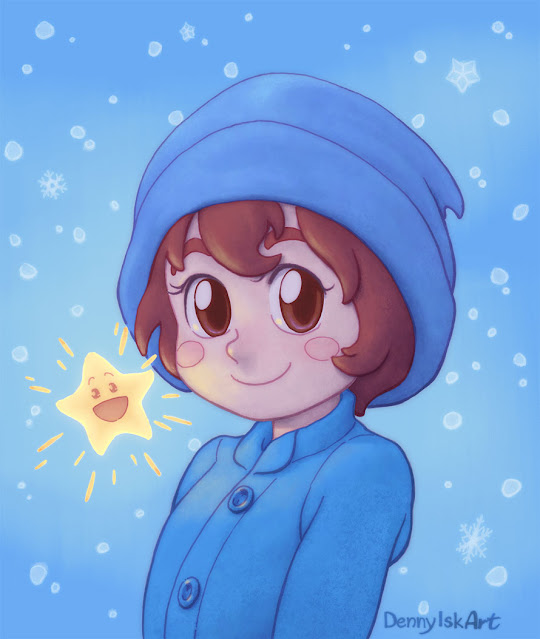
Painting "Cold Weather"

Final painting
This painting saw me getting sidetracked with fightstick art. It was admittedly hard to get back to painting after fiddling with something physical.

With the word "cold" in the title, I knew the background would be cool colors. The unusual choice was using blue for the girl's clothes as well. Applying warm(er) colors to her face and hair would then make them the focus. The warmest region is Little Star, casting extra warm light pass on the girl's face.

I also tried out limited value range. This was hard. I kept wanting to add darker shadows. I am not certain if this experiment worked. It does give a softer feel to the painting, but not in a striking manner that I wanted.

24 March 2024

Fightstick Art

"Cammy" art on Qanba Q1 fightstick

When I posted "Cammy" painting on Reddit, a few people responded that it would look great on a fightstick. I was curious how I could do so but I did not know much about fightsticks. Fortunately, a user with handle "Cringe Dealer 69" was kind enough to share what he knew.

In case you want to know, take a look at "Control Panel Templates" on Focus Attack website. There are so many fightstick brands and models with wildly different aspect ratios, so I went for the model that Cringe Dealer suggested, Qanba Q1.

First thing to do was adapting the painting to Qanba Q1 template: placing the elements to fit a wider canvas and painting any resulting gap. Following Cringe Dealer's suggestion, I added the text label "Menu, Turbo, Mode, Select" for the 4 buttons on upper left corner.

Next came the puzzling bit of info. The fightstick comes with an opaque plastic top. To apply the printed artwork, I need to get a transparent plexi to secure the artwork to the fightstick. This point became clear once I got a fightstick; but I was confused back then and ordered a transparent plexi (which costs around the same as the print cost, effectively doubling what I needed to pay) purely based on trust.

A few weeks later, the plexi and the printed artwork arrived. Note that Focus Attack cut the print according to their fightstick template. Why 2 copies of the print? I would later send one to Cringe Dealer as my thanks for all the knowledge he shared.

Transparent plexi and printed artworks

 Then the fightstick arrived.


Qanba Q1 fightstick

At this point, I needed to figure out how to put the artwork on the fightstick. I followed the YouTube video "Modding and Customizing the Qanba Carbon Arcade Fight Stick with Sanwa Parts Tutorial" by Little Dragon Meiling. To my surprise, I had to unplug all button connections.

Button connections before unplugging

Next, peel stickers and glue that cover the 6 screw that secure the top panel on fightstick chassis. After taking off the screws, the top panel can be removed. The buttons were secured on the top panel; so they needed to be removed.

Top panel taken off

Finally, at this point I could place the artwork on the fightstick top, fit the plexi on top of the artwork, and secure them on the chassis. Then it was simply re-attaching the buttons and re-plugging the connections.

Fightstick after reassembling

I could not help wondering why it was so hard to apply a custom artwork on Qanba Q1. From what I understand, this model is a cheaper model. Apparently higher end models allow easier custom artwork replacement.

More shots of the fightstick below.


29 February 2024

Street Fighter 6 Cammy

Final painting

After many months leaving this as a work in progress, I took the time to paint this image starting in December 2023 until this month. I drew the pencil in July and finished inking early August. My goal from the start was to finish a painting complex enough for my current skill.

Inked image

On hindsight, the composition is rather simple; it felt complex during inking stage. What I remember most, though, was how tough painting was at the beginning stage. There were more elements than what I was used to and I painted myself into muddy look. I did not know what to do to improve the painting, so I left it in WIP stash.

State of the painting when I left off

When I resumed a few months layer, I still did not know what to do, lol. I simply went back mentally prepared to really work on the painting. I began with tidying up sloppy areas. Soon I was trying to make the foreground Cammy warmer (yellow/orange) and the midground cooler (cyan/blue).

A little better with warm and cool colors

The big improvement jump was getting value grouping right. I brighten the foreground Cammy so much that I was certain that I was doing something wrong.

Big improvement due to value grouping

After this step, the painting felt much easier. I made another dramatic change that I was certain to be wrong with the "ink" behind foreground Cammy: I darken them so much that they no longer looked like the ink effect in the game. To compensate, I added halftone pattern to give them "graphic" look. The final touch was the graffiti text to mimic the street style of the game.

I am really happy with how this image turned out. Here is a progress video just for fun.

28 January 2024

Cold Weather

Pencil drawing

This drawing is the first one I posted in 2024. It was a surprise for me—I did not plan this drawing in my schedule. I was drawing in my sketchbook and to my surprise I liked the image. I immediately transferred the image onto an A5 paper—a break from the usual square template.

Life was a bit harder than usual when I drew this. My Dad was hospitalized and later diagnosed with colon cancer. My family banded together to face this, but the difficulty was real. Probably I was just doing something I took comfort in doing. Happily, my Dad still has a chance to recover.

Pen drawing