Showing posts with label painting. Show all posts

30 August 2025

Attempt at Artist Alley (2025 Edition)

July and August were eventful. I applied for a table at Doujima 2026, as I described in previous post. To my disappointment, though, I was not accepted. I still have a theoretical chance to get a table if enough applicants would cancel their tables; but the chance is slim. So I moved on and applied to table at EOY Music, Comics & Arts Festival 2025. This time I was successful.

Meanwhile, I had an episode of sharp, painful toothache. It turned out that I got a cracked tooth. The best alternative was to extract it. It was not so bad but it did make me unable to think of anything else but the dull pain for a few days. It definitely affected my enthusiasm.

Thankfully, my wife was on board with tabling and she got busy planning the booth. She designed the booth structure and got as far as creating it (see the image below). I rode on her energy and got myself together to finalize a set of images to print for our EOY table.

Booth structure and packaging material

First, I drew the booth name and logo. This took me 2 weeks to finish. I felt that I was too slow; but perhaps I was just impatient.

Booth logo

Next, I am polishing the images I have to a quality I feel good enough to sell. I have been working on this ever since I decided to apply for a table. I described how I polished "Dream Bedroom" in the previous post. In this post, I will cover the largest print, "Infinity War".

That's right, I am reviving an old image I drew back in 2018. I intended the image to be a product, so it was only appropriate to finalize it. Here is the image.

What I considered finished in 2018

Something was missing. The characters look interesting, but the background looks static. I experimented with color variations and action lines, as shown below.

Red for Scarlet Witch, green for Dr Strange, orange for everyone else...

I did not like it, though. I felt the bright colors of the background took away interest from the characters. I spent a few days looking at group images, looking for an inspiration.

I noted down the idea I arrived at as follows:

Dark background. Painterly style. Like classic painting.

My intention was:

  1. Make the background dark so the characters can pop out.
  2. Add some elements to suggest lines from the borders into the painting.

I began by painting a new background. I put a horizon line; then painted a sky and a ground. The sky was dark with cloud and smoke; the ground... I was not sure about yet at this stage.

Making the background dark and the characters popping out

Next, I experimented with adding foreground objects an the ground and smoke trails. These would serve intention #2.

Adding lines from the borders into the painting

At this stage, I knew how this painting would finish. All the elements this painting needed were there; I simply needed to polish and render. In other words, I still needed to work more, but the direction was clear. Here is the state of the painting at the time of writing.

The latest state of the painting

There are some trails I am not happy about, so the trails may change, but there will be trails. I want to make the ground look damaged from all the fighting... But as a whole, this painting works much better than the one I started with.

You can get this image as a print from my table at EOY Music, Comics & Arts Festival 2025. The event is on 27 and 28 December 2025, Saturday and Sunday, at Raffle City Convention Centre, Singapore. The print is huge: 117.65 cm ⨉ 33.86 cm (46.3″ ⨉ 13.3″). It will come in one of those tube packaging in the photo above. Hope to see you there!

20 June 2023

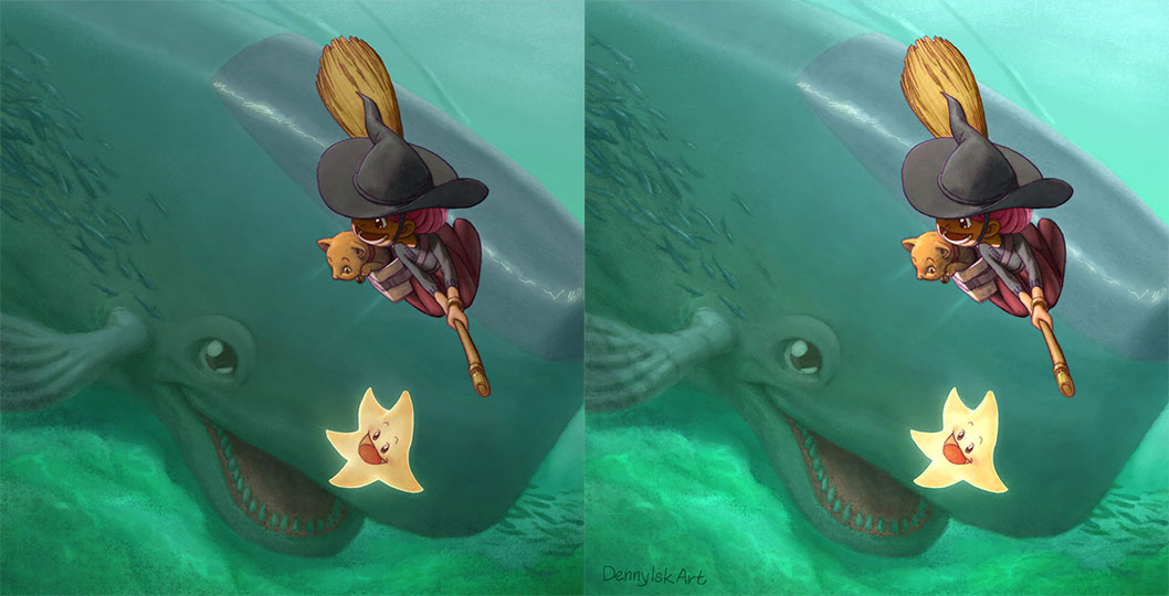
Painting "Hi, Mr Whale!"

 This post is a continuation of the previous post, "Hi, Mr Whale!" In this post I will share my thought process while painting this image.

Final painting

I was infatuated with realism when I started the painting process. Even though I started with color thumbnails—a regular practice—I felt overwhelmed with color picking. I wanted to emphasize the witch with warm color; logically the water should be painted with cool colors.

Color thumbnails

I remembered feeling stuck at this point. I did not know how to proceed. One of the many reasons was water. I knew water had 3 components: reflection, refraction, and haze color. But how do I start? I decided to do something different and painted values.

Value painting

At this point, I was mentally prepared for a difficult painting. I was happy with any progress at all. A small step was overlaying the color thumbnail above the painted values and started painting colors to define shapes.

Painting color over value painting

My guiding principle after this was keeping contrast low for the underwater elements and giving high contrast to the witch and the cat.

Read left to right, top to bottom

Tricks I used:

  • painting caustic on the sea floor;
  • adding darker values around the image to frame the image;
  • reducing the opacity of lineart for underwater elements.

I had a bit of surprise at this point. When I tested the overall brightness by applying Exposure adjustment, I found out that I had been painting 1 step too dark.

The effect of increasing exposure by 1 unit

I felt that I overlooked something significant. The image on the left looks like an overcast day, while the image on the right a sunny day.

At this point, I simply put in the time and energy to polish the painting as far as I could. On hindsight, the final painting still lacks a frame.

Final painting

12 June 2022

Piccolo x Dr Strange


Final poster
I took the release of "Doctor Strange in the Multiverse of Madness" as opportunity to color this image. I drew this as a part of Dragon Ball x MCU poster mini project.

In the process of coloring, I soon realized this piece was boring. After some thinking and panicking, I vaguely recalled the 70-30 rule of composition. I promptly search Youtube for videos to strengthen my understanding and found this video useful: Best kept composition secret - the 30-70 rule

In my case, I decided that 70% of the figure would be in shadows and the remaining 30% would be lit. The result is the following image.

After applying 30-70 rule

The image was still boring. On hindsight, the reason was because I did not plan the final composition. I began playing around with different methods to save this painting. One of such experiments resulted in this.
Dr-r-r-.. Strange-ange-nge-...

It was not bad, but it did not solve the problem with the lower portion of the image: either it was empty (by including only 1 set of legs) or extremely busy (by including all sets of legs). At that point it occurred to me to change the image orientation to landscape and the final poster above was the outcome.

Lesson learned: plan the final composition from the beginning.

28 July 2018

Quick Coloring Practice

I want to practice more coloring, so I started quick coloring practices with the hope of improving my painting skills. I spent 3 sessions, around 30 minutes each for this painting. Let me know what you think! :)

20 February 2018

Painting Chris Hemsworth

Final painting

Last year I wanted to prove to myself that I could still paint digitally and to finish a mini project at the same time. Then I saw this poster for "Thor Ragnarok"...


The bold color scheme real inspired me to start a painting. If I could capture some feel of this poster, I would be happy. I wanted to focus on the painting process, the subject should be something I was familiar with. So I decided to paint a portrait of Chris Hemsworth as Thor. 


I followed a tried and tested work process; in this respect I did not do anything radical. I just wanted to get back to digital painting after a long hiatus. I constantly checked and rechecked proportions to make sure I got the likeness.


In addition, I took my time and painted values as a first pass. Only after I was satisfied enough with the values that I painted the colors.


The first color pass was hard: I got so used to the look of the value painting that the first color pass looked hopelessly bad. Plus, I realized quite late into the color painting that the screen I was working on was abnormally desaturated. The result was an overly saturated painting. Well, good thing it was easy to fix in a digital painting.


For this painting I created a custom Photoshop brush. (It was an okay brush, but I felt the need for a better one.) I was pleasantly surprised that adjusting settings of the custom brush was good enough to paint the base of facial hair. I then developed facial hair volume by layering individual strokes.


For the polish layers, I felt I benefited a lot from my experience with compositing. I realized that painting digitally had a lot in common with compositing. For example, I could make the shadows brighter by applying Levels adjustment. Long time ago I would have been unwilling to do this because "everything must be hand painted". Now I could see that this was the flexibility of working digitally. It was something to embrace, not to avoid.

Well, I think I have said what I wanted to say about this painting and my process. Now I am interested to hear your thoughts about them. Is it too safe? Should I have taken more risk? Let me know in the comments below :)