
I just updated my website, DennyIsk Art. Please take a look, I spent quite some time on it.
 |
| DennyIsk Art website ver 3 |
- must show personality
- NOT sterile
- use handwriting for select labels
To achieve this, I started with a rough sketch.
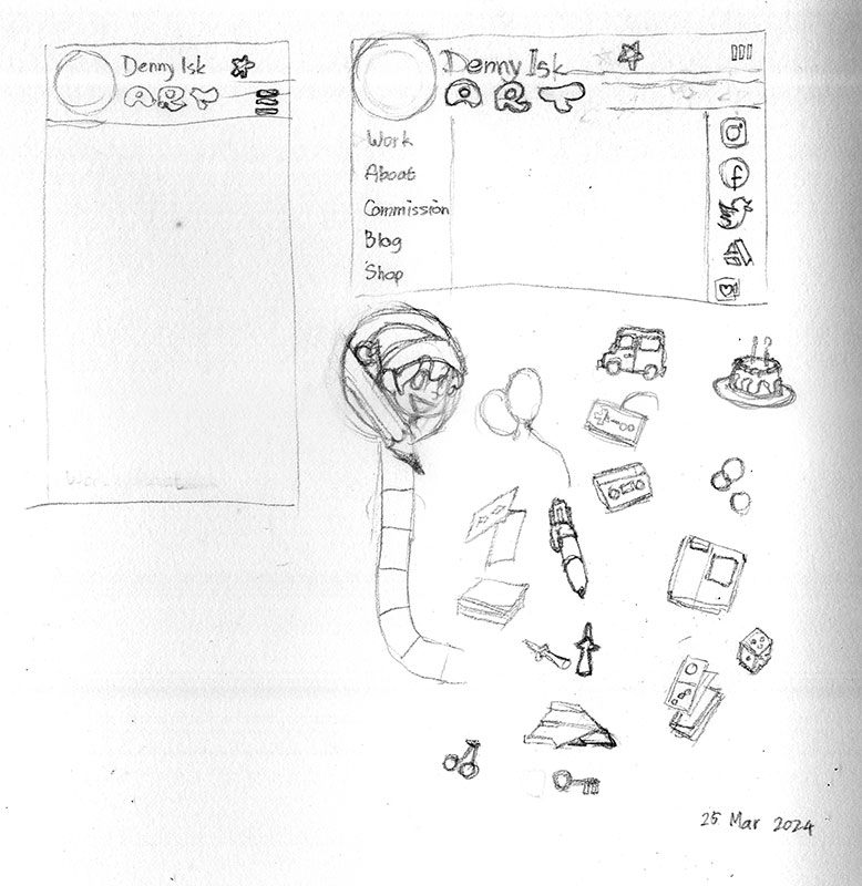 |
| Rough sketch of the concept |
I want to capture my childhood in the concept. This time around I attempted to do so by drawing things I remember liking: birthday cake, car, Nintendo controller, ballons, cassettes, playing cards, marbles, multi-color ballpoint pen, 6-sided die, Nintendo cartridge, paper plane... The last two items are video games: cherry and key. The tiled path under the logo was supposed to be snake and ladder path.
I was happy with the sketch, so I set out implementing it.
 |
| Work in progress |
I was surprised to find how effective straight lines are at making the page look boring. To improve the look a little, I thought I'd add a CSS pattern to the header. The pattern ended up competing with the logo for attention, so I settled with a simple checkerboard and reduce the color contrast.
Next, I did not expect that for tall pages, the side menu results in empty space as I scrolled down. So I moved the navigation items to the center, making the page look plain. I tried to add some personality by applying "random" rotation to navigation items.
Finally, I created thumbnails that link to full-sized image pages.
Let me know what you think about the website in the comments! :)
No comments:
Post a Comment