 |
| Final painting |
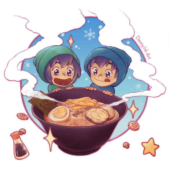
The idea behind this painting is simple: in cold winter, entice audience with something warm.
I started with warm bath (see 1). I felt that a good composition would require a lot of effort, so I moved on to the character being close to giant warm dessert (see 2). Note that I attempted to include Little Star characters until this point.
 |
| Thumbnail of initial ideas |
Next I decided to draw new characters so I can get an easy, symmetrical composition (see 3). I did not know yet what food I was going to draw. I considered soup, tom yum, and hot dessert; and decided to go with ramen because it is probably the most recognizable item.
I learned from "Red Amanita in the Rain" process that I have been lax with composition and color planning. So I continued with more composition options: star-shaped frame (see 4), circular frame (see 5), "speed lines" (see 6), and steam shapes (see 7). I liked all these, but decided to go with steam shape because I thought it would be more unique.
 |
| Second round of thumbnails |
I went at it a little further and sketched the ornamental shapes (see 8). All these culminated in this pencil work.
 |
| Pencil of the final image |
I was really happy with it. I thought the composition worked after all the effort I put in... I soon realized that the image was essentially a ramen packaging design! Lol. But I was okay with that. Maybe a familiar look was not a bad thing.
 |
| Inked final image |
Coloring is another aspect that I had neglected in the last 2 images. I started with color thumbnails (not shown here), but ended up with a straightforward scheme: warm foreground, cool background.
 |
| Rough color scheme. The kids still look like zombies :) |
I started painting the ramen because I wanted the focus of the image to get more work. I then progressed outward to the children and background. One of the new things I wanted to try was adding drawn shapes and symbols to flat areas. So I added some snowflakes. With restraint, I drew only 3. I wanted to draw more, but I felt it would only make the image busier.
I also attempted to control color saturation, though probably I did not do so well in this aspect. Still, I am happy with the final image. More planning definitely paid off.

No comments:
Post a Comment