30 December 2017

Welcoming 2018

It has been 18 months since I started this blog. In this post I would like to note down what have happened so far and finish with my plan for the near future.

The Story So Far...


When I started in June 2016, I did not have a clear direction. I felt the need to draw and I thought posting on a blog will be a motivation to draw regularly. This did not work so well. Only 4 drawings in (see "Cyclist Girl", "Cap Girl", "Girl with Gun", "Captain America + Rockman") I found myself not knowing what to do.

At the same time, I learned that I should build an audience. What a concept! It is simple, yet I never thought of it as an explicit goal. So I started an Instagram account for my drawings. Not long after that, I also create a Facebook page. So far Instagram proved to be more effective in reaching new audience, so I spent more time and effort there. Even now I am not totally sure what different roles a Facebook page and an Instagram account play. Blogging is definitely for something more text heavy, like this post, for reflections and thoughts.

On the drawing side, I took part in Inktober 2016 to draw pictures based on my idea about a girl named Maggie and a boy named Faito. I knew I could not draw 31 full page images in 31 days, so I focused on quality instead of quantity. (See "Noisy", "Collect", "Hungry", "Sad", "Hidden", and "Lost") All in all, Inktober gave me confidence that I could produce more drawings than I previously thought, assuming I am familiar with the subject.

After Inktober I thought adding colors would help me getting noticed. I drew a few pieces with color pencils. (See "Dr Strange", "Welcoming the Year the Rooster", and "Mount Pine Cone") I quickly learned that the main difficulty with color pencil, or any physical media, is the necessity to think about colors and values at the same time. To make matters even more complex, color pencil requires blending. I knew that it was time for me to revisit painting digitally.

For some reason, however, I kept delaying it. Instead, I experimented more with drawings pens. I drew in ink portraits (see "Ink Portrait Study""Elon Musk Portrait"), cars (see "Car Drawings", "Tesla Model S and Mitsubishi Minica"), and Dragon Ball characters as robots (see "Robot Gohan", "Robot Trunks"). (It was around this time I noticed that Instagram was more effective in reaching new audience, so I posted less frequently here.)

I had fun drawing these, but I let the complexity took the fun out of drawing. Only around August 2017 I rekindled the fun of drawing when I returned to drawing kids. These drawings made me want to add more characters to the "Maggie and Faito" concept, but I decided against it. I think I should focus on Maggie and Faito.

I finally got to digital painting in October, clashing with Inktober. I decided to not participate in Inktober 2017. It was a difficult decision to make, especially with what Jake Parker did for his Inktober 2017 (more on this later). I was inspired by the bold colors in "Thor: Ragnarok" trailer. By the time the posters were released, I wanted to paint a portrait of Chris Hemsworth. I promised myself to paint 3 paintings for 3 films ("Thor: Ragnarok", "Justice League", "Star Wars: The Last Jedi") and I did (see "Chris Hemsworth", "Henry Cavill", and "Daisy Ridley"). I will probably wrote another post to reflect on what I learned from painting these.

Next Episode Preview


So far, it looks like colored paintings reached more new audience than inked drawings. My plan is to have another small project in which I will draw characters in "Maggie and Faito" proportions, and then paint them digitally.

Before elaborating on my plan, let us take a look at what Jake Parker worked on for his Inktober. He started with a large piece of paper. Each day, he drew a character inspired by the prompt word for that day. Thus, after 31 days, he finished a large piece with 31 characters!
I cannot describe what an insight this was. I knew a large piece with many characters would take a long time to plan, draw, and color. Just thinking of the amount of work required overwhelmed me. The way Jake approached the problem gave me the confidence to even think about drawing a large piece with many characters.

And so, my plan in 2018 is to draw a spread of Marvel Cinematic Universe characters in anticipation for "Avengers: Infinity War". The goal is to draw and ink 16 characters (at least) by 4 May 2018.

I am excited about this project. I have already practiced with "Maggie and Faito" drawings in which I drew them separately, but planned in such a way that the drawing can be combined. Let us see where this will lead me to :)

08 October 2017

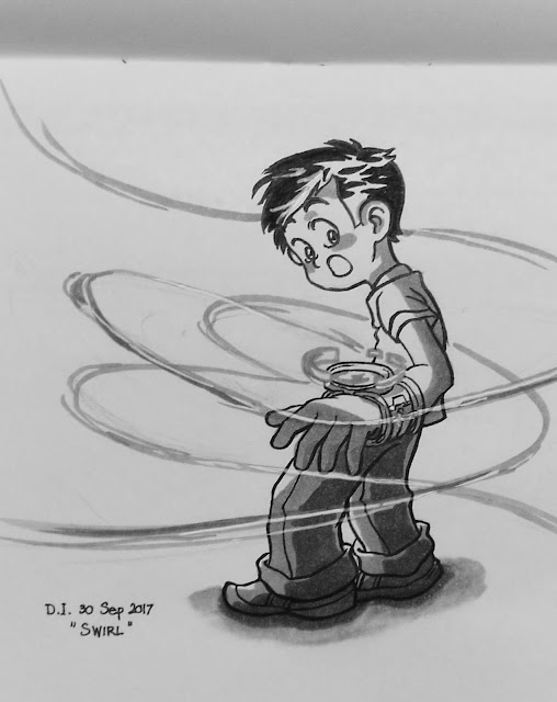
Swirl

Inked drawing

Instagram post:   

This drawing was simpler than usual as there was no background, so I used it as an opportunity to explore brush pen. The pen is a "Sista VIP Twin Type NR-920-W". One of the tips is small, so it was quite easy to ink with.

Another experiment was inking light effects with a copic pen. It quickly grew into shading experiment as well. Copic pens are great for flat shading, but I still have not figured out how to blend.

The picture above was taken with a phone camera. It made the shading look worse that it actually is. I will post a scanned version for comparison soon.

24 September 2017

Tangled

Inked drawing

Instagram post:

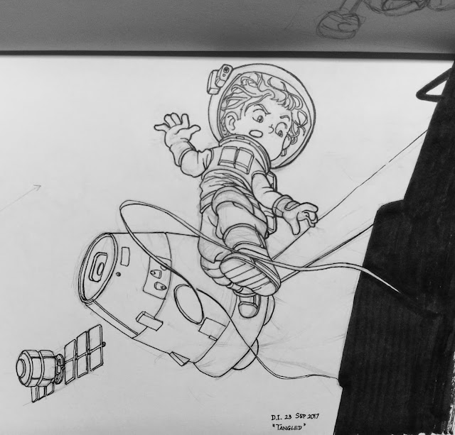
I would like to clarify my description above. Space exploration is one of my interests. However, I could not help feeling that the technology looks complicated (in a not good way), so I never drew anything space-related (unless it is made up, sci-fi stuff).

SpaceX seems to strive to change this perception. This plus Andy Estrada's post made me realize that I should draw more space-related drawings. I hope this one is the first one of many more to come :)

Inktober is coming soon. I am looking forward to it. Last year I finished 7 drawings. I hope to finish more drawings this year.

20 August 2017

Wind Slash


(So I find myself adding more and more complexity to the drawings. Let us see how far I can sustain this.)

I went through one extra drawing step: tidying up the pencil sketch. I started with pose sketches during train ride as the previous few times. However, I found myself drawing poses I didn't like. So I consciously changed the gesture lines I started with. (See the right-most picture.)

I thought multiple lines, one roughly perpendicular to the other, may help. One would be the character pose, the other could be a weapon (I was thinking a staff). My first thought was a kid leaning backwards (to our right), holding a long staff. For a reason I cannot remember, I decided against this and drew the head on the staff line instead. The main gesture line turned into the legs outstretching.
(Bonus: You can see rectangles near the hands. My first thought was drawing fists. However, as I added more curves, I thought open palms would look more elegant.)

Next, while tightening up the sketch (see the picture second from right), I experimented with effects around the character to make the image more interesting. I wanted an element that had elegance and strength; and I decided a wind current so strong it could slash was the element I wanted.

Inking the character was straightforward. (See the picture third from right.) Inking the wind, though, was tricky. For this I used what I learned from my days of copying effect panels, such as this one, from the manga "Break Shot". I was impatient, so the wind ended up looking too solid.

Still, I was happy with how this one turned out. What do you think? If you have ideas you want me to draw, let me know in the comments :)

12 August 2017

Air Brake


The next one in a series of children drawings I am working on. I am taking it easy, so the only theme I had in mind was drawing children in dynamic poses. I started with S-curves as gesture lines and proceeded to find shapes and forms. These led to this pose that looked like a flying kid braking mid-air. I had fun going though these loose exercises, so I will do more soon.

Let me know what you think about the drawing by commenting :)

06 August 2017

I Found The Sword

Lately I felt like I lost focus with my drawings. (On hindsight, perhaps I should not have gotten into too many new things at the same time.) I started drawing this without really knowing what it would end up to be. As the excitement of finding forms grew, I realized that I have missed drawing simple characters like this.

The idea that I had as I drew this was an adventurer, perhaps in the same universe as Maggie and Faito, found a precious sword. Later he would find out that the sword was impractical. Too broad and too short.

I am rather happy with this one. What do you think? Let me know by commenting below :)

(I have been busy drawing more and more figures, so look forward for more drawings soon.)

16 July 2017

Elon Musk Portrait

A post shared by Denny Iskandar (@dennyiskart) on

I have known the names Tesla Motors (which recently changed into Tesla, Inc.) and SpaceX for a few years, but only last year did I decide to look into the stories of the man behind them, Elon Musk. I was captivated by his story. It is incredible that one person could lead two revolutionary companies at the same time.

As a part of the portrait series I am working on, I decided to draw Elon Musk portrait. I attempted to capture subtle skin tones using simplified pen strokes. There are areas that I am happy with, like the light side of the neck, but most areas I am not happy with. I think I should use a larger piece of paper in the next inked portrait piece.

[edited on 17 July 2017]
In a coincidence, Elon Musk had an interview at the National Governors Association Summer Meeting on the same day I published this post. It is perhaps not the most entertaining interview with him, but it reminded me of some observations I had about Mr Musk's appearance (after all that is what I strove to capture in my drawing).

  • Recently he seemed to grow a mustache. I personally find it a little strange.
  • His jaw-cheekbones cause this strange change in the shape of his head. From frontal angle, his face looks squarish. At certain tilt, however, his head starts to look non-squarish. I wonder if there is a proper term for this kind of head shape.
  • He has rather heavy eye bags. They used to be prominent only on his lower eyelids, but recently even the upper eyelids look rather baggy. Most likely because he sleeps very little.
  • He gained weight. This is apparent in his body, but his face seems much less affected.
Anyway, I think history will remember Elon Musk at least for electric cars and reusable rockets. Assuming he does not mess things up (which is very likely (that he does not mess things up, that is)).

[end edit]

Comment below and let me know what you think :)

17 April 2017

Car Drawings


A few weeks ago I recalled that I liked Japanese cars a lot. I could stare at car pamphlets for hours. I even cut a few car pictures, glued them to a carton base, and put them on my desk. I cannot remember what exactly I liked about cars, but the recollection made me want to draw cars again.

I have never been good at drawing cars, so I took this time to improve. I sketched a few, collecting mental rules on cars.

I started off with wrong proportions: the window height is too close to the door height (see the sedans on the upper-left corner). Next, I tend to draw narrow cars, making them look cartoony.

Right now I still have difficulty drawing modern sedans. They have very complex curves (compared to the cars I drew so far, which are blocky).

Do you like cars? What do you think about cars? Let me know in the comments below :)

09 April 2017

Cookies and Warm Milk

I started drawing this on the train on my way home from work. I had a vivid image of children happily eating cookies and drinking milk, so I started drawing. I looked for photo references afterwards, so the final look is a bit different from my mental image.

(I wondered a bit why I had this image; I never had this experience in my childhood. I think one likely reason was the comfort I had at home before this while recovering from a mild fever. I sure hope to see this scene live someday...)

Let me know what you think.

19 February 2017

Pine Cone Mountain


I designed this drawing as a Christmas greeting image. As we will see below, it is a lesson of planning and letting go for me.

Process

I began with the idea of winter holiday. After some thoughts, I came up with two requirements:
  1. a set that immediately conveys "winter holiday" to the audience and
  2. Maggie and Faito are in the drawing.
My solution was to give them a magical place that they visit in their adventure. The place will have snow to give the winter feel. Conveying the idea of holiday was harder.

Thumbnails I drew for planning
I drew the first thumbnail with the idea of showing Faito being so happy and excited. I reinforced this with a Christmas tree in the second (yes, there is a creature head at the top of the tree that we may or may not see in the future--I have not made up my mind) and third thumbnails.

At this point I felt that I need to research more ideas for Christmas holiday symbols. (I usually researched ideas using Pinterest. You can see the images I collected in this "Ornaments" board.) One idea I liked was using a pine cone as a Christmas tree.

Pine cones are small, though. How do I explain a giant pine cone tree? Well, why not make it even larger? A Pine Cone Mountain! And so I arrived at the final idea.

As I drew the huge pine cone in the foreground, I realized that it may not be immediately recognizable as a pine cone because most of its parts were out of frame. In the final image, I added a pine cone in the background as a visual hint. I also added giant Christmas ornaments to reinforce the holiday theme.

So far so good. Except it was already Christmas when I started coloring. Pressed for time, I neglected planning for colors and values. I simply tried out color combinations and went on coloring. The result was quite far from what I wanted.

Lesson 1: never skip color and value planning.

I finished coloring just in time for the new year 2017:


I could have let it go and moved on, but I did not. I thought I could fix the color and values digitally, so I put in more hours to edit the image. The further I worked on it, the more I realized that I was spending time unwisely. In the end, I simply made the background lighter and added simple gradients.

So, lesson 2: let go a finished drawing.

Time is better spent planning for the next piece and working on the next piece.

As always, let me know your thoughts and comments.

27 January 2017

Welcoming the Year of the Rooster

Happy Lunar New Year!

The last two months saw three major holidays packed close to each other. Lunar new year is the last one. I want to draw something nice as a greeting, so I spent longer than usual on this piece.

Designing was surprisingly easy. I knew the rooster would feature prominently because the new year is the year of the rooster. Seeing stylized, abstracted imagery of rooster gave me the idea of a fiery, perhaps imaginary rooster in the background with Maggie and Faito floating in the foreground.

Coloring was more difficult. I still need to practice more with color pencils to control values. I deliberately chose non-traditional Chinese New Year colors (that is, not red). Fortunately, it is easy to find such color schemes in Singapore. (See these examples for an idea.) So I thought of including pink, yellow, and green.
During execution, I was caught in my fascination with the pleasant sequence of red, orange, yellow, lime green, and green. This sequence fills most of the rooster. However, roosters usually have dark tail feathers. My solution was ending the sequence with cyan, sky blue, and blue. I admit the result is perhaps too much, but I think I kept them in some degree of harmony.

(Ah, on hindsight, perhaps Faito's clothes should have been closer to blue.)

Let me know if you enjoy finding out how I worked. Please don't hesitate to tell me what you want to know more so I can include it in future posts.