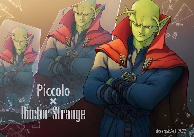
 |
| Final poster |
In the process of coloring, I soon realized this piece was boring. After some thinking and panicking, I vaguely recalled the 70-30 rule of composition. I promptly search Youtube for videos to strengthen my understanding and found this video useful: Best kept composition secret - the 30-70 rule
In my case, I decided that 70% of the figure would be in shadows and the remaining 30% would be lit. The result is the following image.
 |
| After applying 30-70 rule |
 |
| Dr-r-r-.. Strange-ange-nge-... |
It was not bad, but it did not solve the problem with the lower portion of the image: either it was empty (by including only 1 set of legs) or extremely busy (by including all sets of legs). At that point it occurred to me to change the image orientation to landscape and the final poster above was the outcome.
Lesson learned: plan the final composition from the beginning.

No comments:
Post a Comment