31 May 2023

Hi, Mr Whale!


Final Painting
This painting started in mid March, when I brainstormed for ideas to develop into a Witch painting series. The seed idea was a witch speeding just above sea surface. I liked the thumbnail, so I marked it.

The seed idea

I started working on this image a few weeks later, so I needed to remind myself of the idea by drawing more thumbnails. I thought it would be fun if the witch was racing a mermaid or a dolphin (see #1 & #2). I toyed with the idea of the mermaid swimming or even leaping to the air (see #3), but I felt this deviated too much from the seed idea.

Second round of thumbnails

At this stage, the image felt empty with three separate characters. Moreover, their size are too similar—the seed image has 3 character with different sizes, creating some interest. I had to try very hard to break the similar size curse; I seemed to keep drawing similar size characters! My trick in this case was scribbling the silhouette of the witch, then consciously drawing a huge whale in the background. I was quite happy with the result (see #4). Thus, I arrived at the pencil drawing.

The pencil drawing

I wanted to introduce abstract shapes to help the composition; hence the school of fish and whatever it was at the bottom of the sea. Not quite coral, lol.

As an attempt at improving, I started imagining how the final painting would look while inking. I imagined the whale and fish should be blur because they were under water. I experimented with capturing this using duplicated broken lines. On hindsight, broken thin lines could have worked better.

The inked drawing

I will cover the painting process in the next post. Stay tuned!

26 April 2023

Spell Cast!

Final Painting

While working on the previous painting, "Broom Ride!"I was inspired to draw a series of witch illustrations. As a start, I thought of what witches do, riding brooms, brewing potions, casting spells... and sketched out ideas on paper.

For this image, I searched for a good pose with spell casting in mind, as shown in thumbnail set 1 below.

Thumbnail set 1

I liked the pose on the upper left. Imagine a dual-wielding witch in action! It ended up looking like she was dancing, though, so I did not go with it. Some other time perhaps.

I should note that I saw a whole lot of inspiring Harry Potter fanarts while researching for spell casting poses.

After filling a few pages with such thumbnails, one pose I stumbled upon was the one on lower right corner. I liked it, so I went ahead with value planning. I quickly learned that I did not fully understand the pose. The thumbnail was unclear. So I drew a few more thumbnails to resolve the pose, as shown in thumbnail set 2 below.

Thumbnail set 2

Another aspect I wanted to include in the witch series was familiars. For "Broom Ride!", I drew a cat. For this image, I settled on a toad. I was not familiar with drawing toads, so I drew studies from photos and explored stylizations, as shown in thumbnail set 3 below.

Thumbnail set 3

Once I felt familiar enough with all the elements, I started the actual drawing. Important elements from the thumbnail that I strived to reproduce:

  • the dynamic pose,
  • the large eyes,
  • the flowing hair.

For this reason, I gave the witch hat to the toad. I imagined that the young witch dressed her toad familiar like a witch while choosing socially normal dress for herself.

The hand holding the magic wand gave me a hard time. In the end I drew the young witch holding the wand like a pencil.

Pencil of the final drawing

I drew the toad on the right side of the image, overcrowding that side with points of interest: the magic wand, the toad, and the witch's arm. I attempted to balance the composition by moving the toad to the left side.

Inked final drawing

Color scheme was tough. I had a clear image of values but not of colors. Color thumbnails below showed 4 that I thought looked okay. I went with blue and yellow because I liked it best.

Color thumbnails

The painting process felt fast this time around. (I had a difficult time with the previous painting.) I had a small aha moment in the process. These ideas clicked in my mind:

  • Lit areas and areas in shadow can be thought of as partitioning the uncolored area. One partition is light, the other shadow.
  • Thus, painting can be thought of as drawing light shapes and shadow shapes.
  • As the painter, I have the freedom to draw the shapes in anyway I like. I have the freedom to disobey geometry and physics to get well-designed shapes.
  • Designing shapes is therefore more important than rendering light and shadows.
When painting, I previously put more effort in rendering. For this image, I strived to put more thought in drawing the shapes. I was not particularly successful in this, but I was happy with this insight.

I know now that the head shape is bad. I should have resolved the hair before inking instead of settling for the current "cheat". It looked okay in lines, but it did not work in painting. Still, I am happy with parts of this painting. I think it is a partly successful image.

19 March 2023

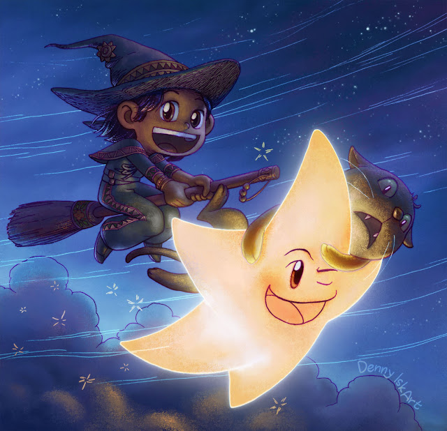
Broom Ride!

Final painting

This image began with a vague idea of using inverted lines as an element. See the "wind" lines on the final painting above as an idea. The lines would suggest a strong directional movement, similar to the diagonal movement in "Little Witch with Frizzy Hair".

As my usual practice, I started with drawing thumbnails. In my mind, I had the image of a young witch riding her broom, surprised by a falling Star. Thumbnail 6 is probably the closest one to that image. Notice how I was fixated with the diagonal line.

Thumbnail set 1

I filled one more page with such thumbnails (not included in this post) and I realized that I was having a difficulty. I did not feel comfortable with the falling Star idea anymore. So I settled on the witch flying side by side with a Star (see 12).

Thumbnail set 2

I was short on time, so I posted the first pencil below.

First pass of pencil

I was not happy with the first pencil for a number of reasons. The characters do not intersect, so there is no cue of depth. Next, I find the Star pose awkward. So I stepped back to thumbnails, hoping to salvage the drawing. I experimented with adding a cat, who obviously would not enjoy flying. As a plus, it added humor to the image. I settled with the cat's expression on thumbnail 15.

Thumbnail set 3

Next, I spent longer time than usual on tightening the pencilI did not want to regret this image just because I rushed the first pencil pass. I made sure Star and Cat intersect the Witch; I put some care on the wind lines; I added background clouds; I added ornaments to the broom... The result is this pencil drawing.

Pencil of the final drawing

After scanning the drawing, I felt that the Witch was lacking personality. I researched for ideas for witch accessories. Why did I not do this at the start, you ask? Well, that's because I was stupid. I found so many ideas that I decided that I would draw a series of witch characters after this drawing.

I decided to make the witch look "tribal" (for lack of a better word). She would be from Mexico. Thus the decorative patterns on her sleeves, hat, cape, pants, and broom. I also added sun-shaped brooch on her hat because why not? And I definitely overdid the hatching on the hat.

Inked final drawing

I was really happy with this inked image. Somehow I turned a rushed pencil into something decent. The next wave of issues is coloring... I did not plan for values. I had so much difficulty while painting that I promised myself to include values in future thumbnails.

I started coloring with color thumbnails. I knew I wanted a blue image, so the background color is always blue. I chose the color scheme on the right and started painting. 

Color thumbnails

This painting was unusual because I switched color scheme in the middle. The image below illustrates the color change. I painted the Star blue, a cool color, and the horizon orange, a warm color. I thought I could make this work, but I found it odd. So I made the Star yellow, a warm color, and the horizon blue, a cold color. I ended up with the formulaic cold background, warm foreground color scheme; but I felt it was the best option for this painting.

Color scheme change

Finally, in the process of painting, I found 2 unexpected things:

  • A large bright object on the foreground (the Star) is awkward.
  • Black clothes (the Witch's) are difficult to paint.
I will keep these in mind in future paintings.

I am happy with the final painting. Perhaps there are a few areas I could have done better, but it is not bad for an image with problematic start.