26 August 2023

Opening Commission!

I am opening a commission service. While preparing the commission sheet, I was surprised that I found only one artwork for "Bust" example. So why not draw a bust sample? It should be fun and easy.

Final painting

I wanted an image of Vegeta from Dragon Ball Z. It should give you an idea how I draw well-known character using my style. Sketching the thumbnails was more difficult than I expected. The pieces I had fun with (#1 & #4) were the ones in which I exaggerated Vegeta being cunning/evil rather than making him sympathetic.

Thumbnails

As the make-believe client, I picked thumbnail #4. I like the exaggerated cruel grin.

I then proceeded to draw the image in actual size: the square is 17 x 17 cm (around 6.7 x 6.7 inches).

Pencil round 1 

The client side of me thought I could push the drawing further, so I did. I enlarged the fist to add more depth to the image. The electric arcs hopefully added some interest.

Pencil round 2

And here is the inked drawing.

Inked drawing

The next stage is coloring. I started with rough color thumbnails. I used different dominant colors to try out different atmospheres:

  • #1 is Super Saiyan Blue look.
  • #2 is classic Super Saiyan look.
  • #3 is Super Saiyan God look. The hair color in this form is reddish black, so I went for complementary green background.
  • #4 is combination of #2 and #3.

Color thumbnails

I had difficulty choosing. Of course my numbering above hints at my choice; but it was not clear during the process. I personally prefer yellow hair; but it is too close to the skin color. In the end I had to choose what in my opinion was the better color scheme.

I am still in the process of painting this image as I write this post. I will update with my progress below.

Update on 10 Sep 2023

Having chosen the color scheme, next step was tidying up the colors. It has the side effect of defining area selections to help with painting. I do not always take this step; sometimes I want to paint loosely.

Flat colors
Add shadows
Adjust lit area; add rim lighting; shift lighting color to green

Paint background; add gradient between face (area of focus) & fist (foreground);
paint eyes; paint light pass on hair & fist; darken fist
At this point, I thought the painting was close to done because I have worked on all areas of the image. However, I felt something was missing. This scenario is difficult to tell on hindsight because on real time back then, I felt uncertainty I no longer feel now that I am writing this.
Remove rim light on lip edge, replace with shadows;
add darker shadow area; darken fist

Change lighting on hair; paint fist; brighten image

As final touches, I decided to darken the frame, background sky, and the foreground fist to emphasize the face. Further, I educed opacity of the lightning to reduce its prominence.
Final painting

And so, we have the final painting. I hope this post gives you a better idea what it is like to order a commission from me. You can do so by going to Commission page on my website.

23 July 2023

S Curves, Witches, and Varsity Jacket

Final painting

It started with S curves. I have been studying images that caught my attention while browsing Reddit and Twitter, figuring out what attracted my attention. One element was S curves that span the width or height of an image. So I drew such an image.

As usual, I started with thumbnails.

Thumbnails

From the top, the S curve starts with the hair, continues through the face and neck, and ends midway through the torso. I extend it to the leg to our right so that curve spans the whole figure. These sketches show the proportions I am most accustomed to (i.e. action manga proportions) as well as the kind of poses I naturally think of (i.e. action manga poses). Hence the clenched fists and "don't mess with me" expression.

I stubbornly added a magic wand because I wanted to stick with witches as a theme. The second sketch (on the right) gave me the idea of varsity jacket.

For background, I went for more curves, making it the theme. However, what concrete shapes would these curves take? I took inspiration from Ayane's drawings (see her works on Twitter). The long, curvy, blobby shapes suggest water; so I drew shapes with water in mind.

At this point I must confess that I forgot to scan the pencil. I did take picture of this work in progress image, in which the background elements were still in pencil.

Inking in progress

Compared to the thumbnails, I softened the girl's expression. She had multiple earrings because she was rebellious punk; while the bracelet was a talisman, probably magical.

I do not have much to say about inking process, so here is the inked piece.

The inked drawing

Next step was painting. I started with painting color thumbnails.

Color thumbnails

Unlike with previous paintings, this time I liked both color schemes. I could only paint one, though. So I went with the one on the right. I do not recall a specific reason; maybe because it felt more like summer than the left one? 

I tried to by conscious about warm and cool colors this time around. Usually varsity jackets have white sleeves, which may grab too much attention. I did not want this, so I gave the sleeves dark shades of orange. To differentiate the jacket from the hair, I made it red.

Adjusting jacket

I experimented with what Marco Bucci called "color vibration". (You can watch his video on YouTube: How to Make Colors Vibrate.) I applied it to the background water. I liked it; my mistake was adding it too soon for this painting. I ended up painting over it later on.

Next, I inverted some part of the inked lines and made them glow lines. I found it great in adding interest to the image. (I feel I should be careful not to rely on this trick to much.)

Glow lines and vignette

I painted cyan rim light to the hair to get cool-warm contrast even though physically it does not really make sense.

At this point, I arrived at the never-ending state in which I kept seeing things to improve or fix. Still, here are the major aspects I worked on to get to the final painting:

  • Painted details on lower part of background water.
  • Painted over the middle and upper part of background water. Bye bye color vibration.
  • Painted blush on the face.
  • Painted glow particles.
So here is the final painting. Do you like it? Let me know in the comments!

Final painting

20 June 2023

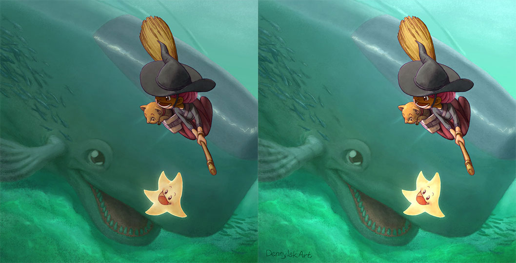
Painting "Hi, Mr Whale!"

 This post is a continuation of the previous post, "Hi, Mr Whale!" In this post I will share my thought process while painting this image.

Final painting

I was infatuated with realism when I started the painting process. Even though I started with color thumbnails—a regular practice—I felt overwhelmed with color picking. I wanted to emphasize the witch with warm color; logically the water should be painted with cool colors.

Color thumbnails

I remembered feeling stuck at this point. I did not know how to proceed. One of the many reasons was water. I knew water had 3 components: reflection, refraction, and haze color. But how do I start? I decided to do something different and painted values.

Value painting

At this point, I was mentally prepared for a difficult painting. I was happy with any progress at all. A small step was overlaying the color thumbnail above the painted values and started painting colors to define shapes.

Painting color over value painting

My guiding principle after this was keeping contrast low for the underwater elements and giving high contrast to the witch and the cat.

Read left to right, top to bottom

Tricks I used:

  • painting caustic on the sea floor;
  • adding darker values around the image to frame the image;
  • reducing the opacity of lineart for underwater elements.

I had a bit of surprise at this point. When I tested the overall brightness by applying Exposure adjustment, I found out that I had been painting 1 step too dark.

The effect of increasing exposure by 1 unit

I felt that I overlooked something significant. The image on the left looks like an overcast day, while the image on the right a sunny day.

At this point, I simply put in the time and energy to polish the painting as far as I could. On hindsight, the final painting still lacks a frame.

Final painting