17 December 2023

Greeting Ms Moon

Final Painting

It is December and Christmas is coming. I decided to continue working on this piece I drew and painted last year. I could not finish it on time for Christmas then.

Reworking a painting felt different from painting from scratch. Recalling what I wanted to paint was not easy. One thing I recalled wanting to do was adding depth to the image. So I started with painting over the background. I think I was fairly successful to give the illusion of depth.

I soon realized that I did not plan the lighting when I drew this. Both light sources are from the right. Further, Ms Moon looks further into the image compared to the three characters. I tried my best to ignore these and painted warm-cool colors while keeping the lighting looks believable even if it was not correct. I was not totally happy with Lise's face (the girl), but I was at a loss about what I could fix.

I think this piece taught me why night scenes are more difficult to paint than day scenes.

Well, it is December and Christmas is coming. I hope everyone is doing okay. Happy holidays!

06 November 2023

3D Collaboration

Early October, I saw a post by a certain chicdead26 in Ko-fi Discord Server, "collaboration" channel. Here is the post, albeit in archived form:
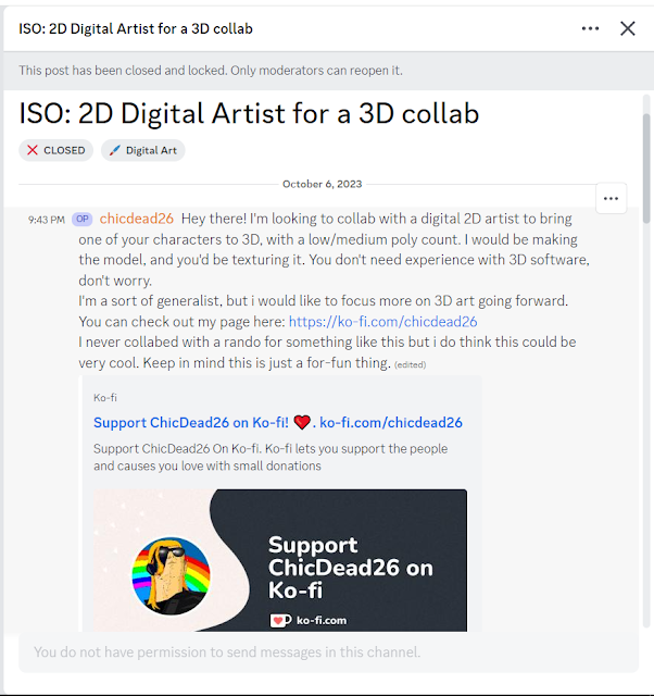
Inciting incident

At this point I wanted to explore art collaboration because I did not have luck with getting commission work. It may sound strange, but I wanted to work on something with input from another person.

So I replied to the post, expressing my interest. Perhaps partly on a whim. To my surprise, ChicDead26 was responsive. Soon we were talking via Discord Direct Messages. We agreed to work on a 3D model for the witch depicted in "Broom Ride!".

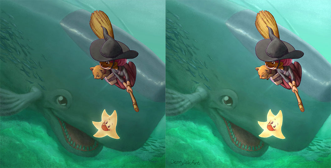
The character we were to work on (the witch, not the star nor the cat)

I quickly found out that ChicDead26 was dead serious! I was just suggesting, "Oh, shall I maybe draw T pose turn around of the character?" and he already got a base mesh! Not only that, he asked many good questions about the character appearance since he only got the image above as reference. So I answered as well as I could and started drawing a character turnaround sheet.

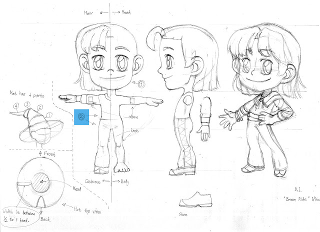
First attempt at character turnaround sheet

I started by drawing the rightmost figure to get myself familiar with the character. I drew "Broom Ride" seven months ago; it has been a while. Plus, I have not thought of her hairstyle without the hat.

Next, I drew the front view. I struggled with accurate drawing. Then I proceeded to drawing the side view... and I really struggled to make sure elements are consistent in the 2 views. I probably made her profile too complicated; but at the time I did not realize that I should simplify. My mindset was still in stylized drawing land, not technical drawing for character sheet land.

Did I say that ChicDead26 was dead serious? Well, he was. He already got the base mesh to the correct proportion after I sent him the turnaround sheet, so I had the chance to amend my drawing. The body shape was too boyish in the front view; so I made the amendments below.

Amended character turnaround sheet

I felt bad enough about the head that I drew a turnaround sheet for the head. ChicDead more or less ignored it; but I have to show that at least I did some work (even if it was not used), right?

Head turnaround sheet

I was concerned about the head shape of the 3D model, so I drew another one more straight to the point.

Highlighting part of the head I was concerned about

So ChicDead26, being dead serious, amended the model and I was happy.

Probably you saw from the drawings that I also had the hat in mind. Well, ChicDead26 countered with a simpler idea of a conic hat that he would rig to deform, so we went with that. It was a time-saving move on hindsight. A good thing I did not insist on modeling the complicated hat, lol.

And so, after around a week, the 3D mesh was completed; then after 4 days, the UVs were ready. It was time for me to paint the textures. I had to admit I was worried because I usually work slowly, while ChicDead26 worked fast. Thankfully rigging a whole character was enough to occupy him while I wrestled with Blender UI and tried to paint some textures.

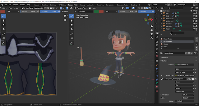
Unable to comply, texturing in progress

I did make use of this opportunity to learn the software. I enjoyed using Blender texture painting. It needs some getting used to; but I realized that it was possible for me to exclusively use Blender texture painting to create stylized textures (and never need to move to Photoshop). I also re-learned the hard way that texturing crisp geometric shapes was a pain.

Back to the collaboration, I took around 12 days to work on the textures (and the result was somewhat simple). Meanwhile, ChicDead26 was already posing the character to recreate the pose in the "Broom Ride" painting. He even set up the lighting and rotating camera. All I did was... made the lighting brighter with rim light. And here is the result.


I was happy with this collaboration and the outcome. On reflection while writing this post, I am even happier with the outcome. Seriously, ChicDead26 worked fast; creating a 3D model from scratch in 1 month. I wish you all the best, man!

You can find ChicDead26 on his socials:

10 September 2023

Reflections 2023

I felt the need to write another reflection post because I experienced some interesting developments recently.

By coincidence, I wrote "Reflections 2022" almost exactly a year ago. My plan was to create a series of images that capture bitter-sweet feelings from my childhood.

I am pleased with the images I painted in this one year period, so much so that I replaced the portfolio on my website with some of these images: "Little Star Dreaming", "Mid Autumn Festival", "Warm Ramen in a Cold Winter's Day", "Year of the Rabbit", "Little Witch with Frizzy Hair", "Broom Ride!", "Spell Cast!", "Mermaid", and "Hi, Mr Whale!".

Along the way, I found myself liking "witch" as a theme and adopted "witch series" as a theme. The theme in my mind morphed into "draw witches with things associated with childhood".

In terms of painting, I developed the following standard practices:

  • Colorize inked lines.
  • Overlay a low-opacity layer of blurred inked lines.
  • Invert some part of inked lines as glow lines.
  • Be conscious of applying cool and warm colors.

In terms of monetization, I started a print shop at INPRNT.

I followed this plan until end of May 2023 with "Hi, Mr Whale!".

In June 2023, I wanted to start accepting commissions and had to adapt the plan. I did not get a strong positive reaction from the childhood-themed images. I need to explore adjacent ideas:

  • Keep the witch theme and experiment with graphic elements in character illustrations. Outcome: "Punk Witch" and "Flame Witch".
  • Draw images that make audience recall their childhood. Outcome: Cammy fanart. My logic is admittedly roundabout. Street Fighter is a nostalgia for me. Recently "Street Fighter 6" was released. so why not draw a SF6 fanart? Looking at the new roster, I liked Cammy's new design and so Cammy fanart it was.
  • Draw images of special dates with children's point of view. Outcome: "National Day". In the coming months, I plan to draw one for Mid Autumn Festival and one for Halloween.

While preparing for sample images to accept commissions, I found out that I had only one sample bust image, so I painted another one, "Everything Goes According to Vegeta's Plan".

Mid August I started accepting commissions. I learned quickly why commission artist do not use Instagram for commissions. I received at least 3 direct message requests that turned out to be scams. Their characteristics are:

  • The requested image is not related to my art. The requests are pet pictures, even though I do not draw pets.
  • The requesters are eager to pay more than my price. A common tactic is to ask for multiple images.
The first time I received such a DM, I followed through with accepting the order and requesting a down payment. The scammer (a she) insisted on using PayPal. After I sent my PayPal link, she claimed to have sent $200. To add to the urgency, she attempted to audio call me via Instagram. She then sent this line: "The money has been deducted from my account kindly check your paypal email address inbox and spam too,the last mail I got from PayPal got hold on my spam". I did receive an email in my spam. It was a phishing email sent from a Gmail account pretending to be PayPal. I don't remember the content of the email, but I remember it saying that the payment of USD200 exceeded my PayPal daily limit and that I should click links to remedy this.

It was interesting and infuriating to learn about art scams firsthand. I know now why commission artists do not use Instagram to accept orders. Too much time wasted on scams. I still do not have a good solution to this issue.

Sadly, I have not gotten a legitimate commission order yet.

Finally, let me share another story. By luck, "Hi, Mr Whale!" got a Daily Deviation feature on DeviantArt. The effect was gratifying: I received a lot of love and comments, some of which seem legit. Of course a lot more are most certainly bots. In addition, I received a number of chat requests that are most likely scams. Some are even exact copy-paste. All of them ask to purchase one of my artworks. I do not know the aim of these requests; I simply ignore them.

I share this story because I start to see the scams as a balancer to the gratification of getting a Daily Deviation. I realize that (1) getting attention was luck and (2) many people use social media to get attention.

As for my future plan, I am still hoping to accept commissions. I am figuring out how to strike the balance between convenient ordering and filtering out scams.

26 August 2023

Opening Commission!

I am opening a commission service. While preparing the commission sheet, I was surprised that I found only one artwork for "Bust" example. So why not draw a bust sample? It should be fun and easy.

Final painting

I wanted an image of Vegeta from Dragon Ball Z. It should give you an idea how I draw well-known character using my style. Sketching the thumbnails was more difficult than I expected. The pieces I had fun with (#1 & #4) were the ones in which I exaggerated Vegeta being cunning/evil rather than making him sympathetic.

Thumbnails

As the make-believe client, I picked thumbnail #4. I like the exaggerated cruel grin.

I then proceeded to draw the image in actual size: the square is 17 x 17 cm (around 6.7 x 6.7 inches).

Pencil round 1 

The client side of me thought I could push the drawing further, so I did. I enlarged the fist to add more depth to the image. The electric arcs hopefully added some interest.

Pencil round 2

And here is the inked drawing.

Inked drawing

The next stage is coloring. I started with rough color thumbnails. I used different dominant colors to try out different atmospheres:

  • #1 is Super Saiyan Blue look.
  • #2 is classic Super Saiyan look.
  • #3 is Super Saiyan God look. The hair color in this form is reddish black, so I went for complementary green background.
  • #4 is combination of #2 and #3.

Color thumbnails

I had difficulty choosing. Of course my numbering above hints at my choice; but it was not clear during the process. I personally prefer yellow hair; but it is too close to the skin color. In the end I had to choose what in my opinion was the better color scheme.

I am still in the process of painting this image as I write this post. I will update with my progress below.

Update on 10 Sep 2023

Having chosen the color scheme, next step was tidying up the colors. It has the side effect of defining area selections to help with painting. I do not always take this step; sometimes I want to paint loosely.

Flat colors
Add shadows
Adjust lit area; add rim lighting; shift lighting color to green

Paint background; add gradient between face (area of focus) & fist (foreground);
paint eyes; paint light pass on hair & fist; darken fist
At this point, I thought the painting was close to done because I have worked on all areas of the image. However, I felt something was missing. This scenario is difficult to tell on hindsight because on real time back then, I felt uncertainty I no longer feel now that I am writing this.
Remove rim light on lip edge, replace with shadows;
add darker shadow area; darken fist

Change lighting on hair; paint fist; brighten image

As final touches, I decided to darken the frame, background sky, and the foreground fist to emphasize the face. Further, I educed opacity of the lightning to reduce its prominence.
Final painting

And so, we have the final painting. I hope this post gives you a better idea what it is like to order a commission from me. You can do so by going to Commission page on my website.

23 July 2023

S Curves, Witches, and Varsity Jacket

Final painting

It started with S curves. I have been studying images that caught my attention while browsing Reddit and Twitter, figuring out what attracted my attention. One element was S curves that span the width or height of an image. So I drew such an image.

As usual, I started with thumbnails.

Thumbnails

From the top, the S curve starts with the hair, continues through the face and neck, and ends midway through the torso. I extend it to the leg to our right so that curve spans the whole figure. These sketches show the proportions I am most accustomed to (i.e. action manga proportions) as well as the kind of poses I naturally think of (i.e. action manga poses). Hence the clenched fists and "don't mess with me" expression.

I stubbornly added a magic wand because I wanted to stick with witches as a theme. The second sketch (on the right) gave me the idea of varsity jacket.

For background, I went for more curves, making it the theme. However, what concrete shapes would these curves take? I took inspiration from Ayane's drawings (see her works on Twitter). The long, curvy, blobby shapes suggest water; so I drew shapes with water in mind.

At this point I must confess that I forgot to scan the pencil. I did take picture of this work in progress image, in which the background elements were still in pencil.

Inking in progress

Compared to the thumbnails, I softened the girl's expression. She had multiple earrings because she was rebellious punk; while the bracelet was a talisman, probably magical.

I do not have much to say about inking process, so here is the inked piece.

The inked drawing

Next step was painting. I started with painting color thumbnails.

Color thumbnails

Unlike with previous paintings, this time I liked both color schemes. I could only paint one, though. So I went with the one on the right. I do not recall a specific reason; maybe because it felt more like summer than the left one? 

I tried to by conscious about warm and cool colors this time around. Usually varsity jackets have white sleeves, which may grab too much attention. I did not want this, so I gave the sleeves dark shades of orange. To differentiate the jacket from the hair, I made it red.

Adjusting jacket

I experimented with what Marco Bucci called "color vibration". (You can watch his video on YouTube: How to Make Colors Vibrate.) I applied it to the background water. I liked it; my mistake was adding it too soon for this painting. I ended up painting over it later on.

Next, I inverted some part of the inked lines and made them glow lines. I found it great in adding interest to the image. (I feel I should be careful not to rely on this trick to much.)

Glow lines and vignette

I painted cyan rim light to the hair to get cool-warm contrast even though physically it does not really make sense.

At this point, I arrived at the never-ending state in which I kept seeing things to improve or fix. Still, here are the major aspects I worked on to get to the final painting:

  • Painted details on lower part of background water.
  • Painted over the middle and upper part of background water. Bye bye color vibration.
  • Painted blush on the face.
  • Painted glow particles.
So here is the final painting. Do you like it? Let me know in the comments!

Final painting

20 June 2023

Painting "Hi, Mr Whale!"

 This post is a continuation of the previous post, "Hi, Mr Whale!" In this post I will share my thought process while painting this image.

Final painting

I was infatuated with realism when I started the painting process. Even though I started with color thumbnails—a regular practice—I felt overwhelmed with color picking. I wanted to emphasize the witch with warm color; logically the water should be painted with cool colors.

Color thumbnails

I remembered feeling stuck at this point. I did not know how to proceed. One of the many reasons was water. I knew water had 3 components: reflection, refraction, and haze color. But how do I start? I decided to do something different and painted values.

Value painting

At this point, I was mentally prepared for a difficult painting. I was happy with any progress at all. A small step was overlaying the color thumbnail above the painted values and started painting colors to define shapes.

Painting color over value painting

My guiding principle after this was keeping contrast low for the underwater elements and giving high contrast to the witch and the cat.

Read left to right, top to bottom

Tricks I used:

  • painting caustic on the sea floor;
  • adding darker values around the image to frame the image;
  • reducing the opacity of lineart for underwater elements.

I had a bit of surprise at this point. When I tested the overall brightness by applying Exposure adjustment, I found out that I had been painting 1 step too dark.

The effect of increasing exposure by 1 unit

I felt that I overlooked something significant. The image on the left looks like an overcast day, while the image on the right a sunny day.

At this point, I simply put in the time and energy to polish the painting as far as I could. On hindsight, the final painting still lacks a frame.

Final painting

31 May 2023

Hi, Mr Whale!


Final Painting
This painting started in mid March, when I brainstormed for ideas to develop into a Witch painting series. The seed idea was a witch speeding just above sea surface. I liked the thumbnail, so I marked it.

The seed idea

I started working on this image a few weeks later, so I needed to remind myself of the idea by drawing more thumbnails. I thought it would be fun if the witch was racing a mermaid or a dolphin (see #1 & #2). I toyed with the idea of the mermaid swimming or even leaping to the air (see #3), but I felt this deviated too much from the seed idea.

Second round of thumbnails

At this stage, the image felt empty with three separate characters. Moreover, their size are too similar—the seed image has 3 character with different sizes, creating some interest. I had to try very hard to break the similar size curse; I seemed to keep drawing similar size characters! My trick in this case was scribbling the silhouette of the witch, then consciously drawing a huge whale in the background. I was quite happy with the result (see #4). Thus, I arrived at the pencil drawing.

The pencil drawing

I wanted to introduce abstract shapes to help the composition; hence the school of fish and whatever it was at the bottom of the sea. Not quite coral, lol.

As an attempt at improving, I started imagining how the final painting would look while inking. I imagined the whale and fish should be blur because they were under water. I experimented with capturing this using duplicated broken lines. On hindsight, broken thin lines could have worked better.

The inked drawing

I will cover the painting process in the next post. Stay tuned!

26 April 2023

Spell Cast!

Final Painting

While working on the previous painting, "Broom Ride!"I was inspired to draw a series of witch illustrations. As a start, I thought of what witches do, riding brooms, brewing potions, casting spells... and sketched out ideas on paper.

For this image, I searched for a good pose with spell casting in mind, as shown in thumbnail set 1 below.

Thumbnail set 1

I liked the pose on the upper left. Imagine a dual-wielding witch in action! It ended up looking like she was dancing, though, so I did not go with it. Some other time perhaps.

I should note that I saw a whole lot of inspiring Harry Potter fanarts while researching for spell casting poses.

After filling a few pages with such thumbnails, one pose I stumbled upon was the one on lower right corner. I liked it, so I went ahead with value planning. I quickly learned that I did not fully understand the pose. The thumbnail was unclear. So I drew a few more thumbnails to resolve the pose, as shown in thumbnail set 2 below.

Thumbnail set 2

Another aspect I wanted to include in the witch series was familiars. For "Broom Ride!", I drew a cat. For this image, I settled on a toad. I was not familiar with drawing toads, so I drew studies from photos and explored stylizations, as shown in thumbnail set 3 below.

Thumbnail set 3

Once I felt familiar enough with all the elements, I started the actual drawing. Important elements from the thumbnail that I strived to reproduce:

  • the dynamic pose,
  • the large eyes,
  • the flowing hair.

For this reason, I gave the witch hat to the toad. I imagined that the young witch dressed her toad familiar like a witch while choosing socially normal dress for herself.

The hand holding the magic wand gave me a hard time. In the end I drew the young witch holding the wand like a pencil.

Pencil of the final drawing

I drew the toad on the right side of the image, overcrowding that side with points of interest: the magic wand, the toad, and the witch's arm. I attempted to balance the composition by moving the toad to the left side.

Inked final drawing

Color scheme was tough. I had a clear image of values but not of colors. Color thumbnails below showed 4 that I thought looked okay. I went with blue and yellow because I liked it best.

Color thumbnails

The painting process felt fast this time around. (I had a difficult time with the previous painting.) I had a small aha moment in the process. These ideas clicked in my mind:

  • Lit areas and areas in shadow can be thought of as partitioning the uncolored area. One partition is light, the other shadow.
  • Thus, painting can be thought of as drawing light shapes and shadow shapes.
  • As the painter, I have the freedom to draw the shapes in anyway I like. I have the freedom to disobey geometry and physics to get well-designed shapes.
  • Designing shapes is therefore more important than rendering light and shadows.
When painting, I previously put more effort in rendering. For this image, I strived to put more thought in drawing the shapes. I was not particularly successful in this, but I was happy with this insight.

I know now that the head shape is bad. I should have resolved the hair before inking instead of settling for the current "cheat". It looked okay in lines, but it did not work in painting. Still, I am happy with parts of this painting. I think it is a partly successful image.

19 March 2023

Broom Ride!

Final painting

This image began with a vague idea of using inverted lines as an element. See the "wind" lines on the final painting above as an idea. The lines would suggest a strong directional movement, similar to the diagonal movement in "Little Witch with Frizzy Hair".

As my usual practice, I started with drawing thumbnails. In my mind, I had the image of a young witch riding her broom, surprised by a falling Star. Thumbnail 6 is probably the closest one to that image. Notice how I was fixated with the diagonal line.

Thumbnail set 1

I filled one more page with such thumbnails (not included in this post) and I realized that I was having a difficulty. I did not feel comfortable with the falling Star idea anymore. So I settled on the witch flying side by side with a Star (see 12).

Thumbnail set 2

I was short on time, so I posted the first pencil below.

First pass of pencil

I was not happy with the first pencil for a number of reasons. The characters do not intersect, so there is no cue of depth. Next, I find the Star pose awkward. So I stepped back to thumbnails, hoping to salvage the drawing. I experimented with adding a cat, who obviously would not enjoy flying. As a plus, it added humor to the image. I settled with the cat's expression on thumbnail 15.

Thumbnail set 3

Next, I spent longer time than usual on tightening the pencilI did not want to regret this image just because I rushed the first pencil pass. I made sure Star and Cat intersect the Witch; I put some care on the wind lines; I added background clouds; I added ornaments to the broom... The result is this pencil drawing.

Pencil of the final drawing

After scanning the drawing, I felt that the Witch was lacking personality. I researched for ideas for witch accessories. Why did I not do this at the start, you ask? Well, that's because I was stupid. I found so many ideas that I decided that I would draw a series of witch characters after this drawing.

I decided to make the witch look "tribal" (for lack of a better word). She would be from Mexico. Thus the decorative patterns on her sleeves, hat, cape, pants, and broom. I also added sun-shaped brooch on her hat because why not? And I definitely overdid the hatching on the hat.

Inked final drawing

I was really happy with this inked image. Somehow I turned a rushed pencil into something decent. The next wave of issues is coloring... I did not plan for values. I had so much difficulty while painting that I promised myself to include values in future thumbnails.

I started coloring with color thumbnails. I knew I wanted a blue image, so the background color is always blue. I chose the color scheme on the right and started painting. 

Color thumbnails

This painting was unusual because I switched color scheme in the middle. The image below illustrates the color change. I painted the Star blue, a cool color, and the horizon orange, a warm color. I thought I could make this work, but I found it odd. So I made the Star yellow, a warm color, and the horizon blue, a cold color. I ended up with the formulaic cold background, warm foreground color scheme; but I felt it was the best option for this painting.

Color scheme change

Finally, in the process of painting, I found 2 unexpected things:

  • A large bright object on the foreground (the Star) is awkward.
  • Black clothes (the Witch's) are difficult to paint.
I will keep these in mind in future paintings.

I am happy with the final painting. Perhaps there are a few areas I could have done better, but it is not bad for an image with problematic start.