The idea for these began in October 2018 when I sketched cute animals in Halloween-themed hats, shown below.
The starter sketchI don't quite remember why a chicken and a dinosaur. Even then, I already knew that Chicky is a girl, thus the witch hat and wig, while Dino is a boy. I did not know what to do with them and simply marked the sketch to follow up someday.
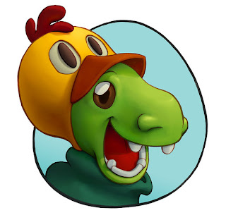
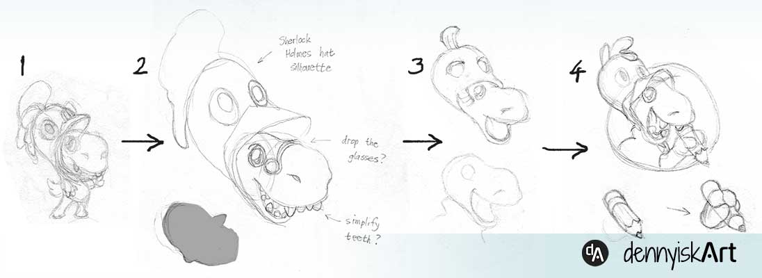
In late 2021, I revisited Dino because I want a logo for dennyiskArt website. Below is my design process.
Dino design processI wanted a quirky logo, thus the chicken hat and antique glasses on (1). Then I drew (2), a larger sketch of the head to find the head silhouette ("Sherlock Holmes hat") and refine the elements.
I liked (2), but it was too busy for a logo. I simplified the elements in (3) and tested the silhouette using a pumpkin hat. I preferred chicken hat, as shown in (4), and finalized the logo by adding a circle frame and a pencil holding hand.
I didn't use the image as website logo, but I thought it would be funny to pair it with a chicken in a dino hat. Accidentally, the circle frame was egg-shaped, a plus in my mind because both dino and chicken hatch from an egg.
Chicky design processI sketched (1) around the same time a Dino's (1). I was not happy with it because the silhouette was not as strong as Dino's. Well, since Dino had rounded shapes, I thought I would use square shape for Chicky, as shown in (2) upper; and then soften it as shown in (2) lower.
After that, it was just a matter of adding details to get to (3). I drew (4) to match the circle frame and explored some variation in proportions. As the handwritten note says, I found (4) not cute. The final drawing, thankfully, was much cuter.
It was relatively easy to draw these because I love the idea. Painting was tough because I did not fully understand that look I wanted. I ended up taking a long time painting these.
"Dino" painting processAt the start I needed some time to find a cohesive color scheme. I needed to keep checking the saturation as well. I just revisited painting digitally, so I took around a month to finish the painting.
"Chicky" painting processWith "Chicky", I struggled with the shadows. Do I make them colder to contrast with the warm midtones? Are the shadows too cold? In the middle of the painting I decided to revise the shape of the shadows because I thought the nose part of the hat should cast more shadows on her face. Similar to "Dino", this took me a month to finish.
All in all, I am rather happy with these two paintings. They look cute and fun. What do you think? Share your thoughts in the comments :)


