 |
| Final Painting |
While working on the previous painting, "Broom Ride!", I was inspired to draw a series of witch illustrations. As a start, I thought of what witches do, riding brooms, brewing potions, casting spells... and sketched out ideas on paper.
For this image, I searched for a good pose with spell casting in mind, as shown in thumbnail set 1 below.
 |
| Thumbnail set 1 |
I liked the pose on the upper left. Imagine a dual-wielding witch in action! It ended up looking like she was dancing, though, so I did not go with it. Some other time perhaps.
I should note that I saw a whole lot of inspiring Harry Potter fanarts while researching for spell casting poses.
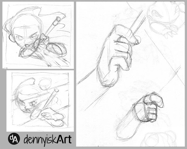
After filling a few pages with such thumbnails, one pose I stumbled upon was the one on lower right corner. I liked it, so I went ahead with value planning. I quickly learned that I did not fully understand the pose. The thumbnail was unclear. So I drew a few more thumbnails to resolve the pose, as shown in thumbnail set 2 below.
 |
| Thumbnail set 2 |
Another aspect I wanted to include in the witch series was familiars. For "Broom Ride!", I drew a cat. For this image, I settled on a toad. I was not familiar with drawing toads, so I drew studies from photos and explored stylizations, as shown in thumbnail set 3 below.
 |
| Thumbnail set 3 |
Once I felt familiar enough with all the elements, I started the actual drawing. Important elements from the thumbnail that I strived to reproduce:
- the dynamic pose,
- the large eyes,
- the flowing hair.
For this reason, I gave the witch hat to the toad. I imagined that the young witch dressed her toad familiar like a witch while choosing socially normal dress for herself.
The hand holding the magic wand gave me a hard time. In the end I drew the young witch holding the wand like a pencil.
 |
| Pencil of the final drawing |
I drew the toad on the right side of the image, overcrowding that side with points of interest: the magic wand, the toad, and the witch's arm. I attempted to balance the composition by moving the toad to the left side.
 |
| Inked final drawing |
Color scheme was tough. I had a clear image of values but not of colors. Color thumbnails below showed 4 that I thought looked okay. I went with blue and yellow because I liked it best.
 |
| Color thumbnails |
The painting process felt fast this time around. (I had a difficult time with the previous painting.) I had a small aha moment in the process. These ideas clicked in my mind:
- Lit areas and areas in shadow can be thought of as partitioning the uncolored area. One partition is light, the other shadow.
- Thus, painting can be thought of as drawing light shapes and shadow shapes.
- As the painter, I have the freedom to draw the shapes in anyway I like. I have the freedom to disobey geometry and physics to get well-designed shapes.
- Designing shapes is therefore more important than rendering light and shadows.
I know now that the head shape is bad. I should have resolved the hair before inking instead of settling for the current "cheat". It looked okay in lines, but it did not work in painting. Still, I am happy with parts of this painting. I think it is a partly successful image.

No comments:
Post a Comment