
This post is a continuation of the previous post, "Hi, Mr Whale!" In this post I will share my thought process while painting this image.
 |
| Final painting |
I was infatuated with realism when I started the painting process. Even though I started with color thumbnails—a regular practice—I felt overwhelmed with color picking. I wanted to emphasize the witch with warm color; logically the water should be painted with cool colors.
 |
| Color thumbnails |
I remembered feeling stuck at this point. I did not know how to proceed. One of the many reasons was water. I knew water had 3 components: reflection, refraction, and haze color. But how do I start? I decided to do something different and painted values.
 |
| Value painting |
At this point, I was mentally prepared for a difficult painting. I was happy with any progress at all. A small step was overlaying the color thumbnail above the painted values and started painting colors to define shapes.
 |
| Painting color over value painting |
My guiding principle after this was keeping contrast low for the underwater elements and giving high contrast to the witch and the cat.
 |
| Read left to right, top to bottom |
Tricks I used:
- painting caustic on the sea floor;
- adding darker values around the image to frame the image;
- reducing the opacity of lineart for underwater elements.
I had a bit of surprise at this point. When I tested the overall brightness by applying Exposure adjustment, I found out that I had been painting 1 step too dark.
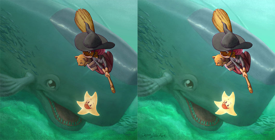 |
| The effect of increasing exposure by 1 unit |
I felt that I overlooked something significant. The image on the left looks like an overcast day, while the image on the right a sunny day.
At this point, I simply put in the time and energy to polish the painting as far as I could. On hindsight, the final painting still lacks a frame.
|
| Final painting |
No comments:
Post a Comment